Site Navigation Tutorial
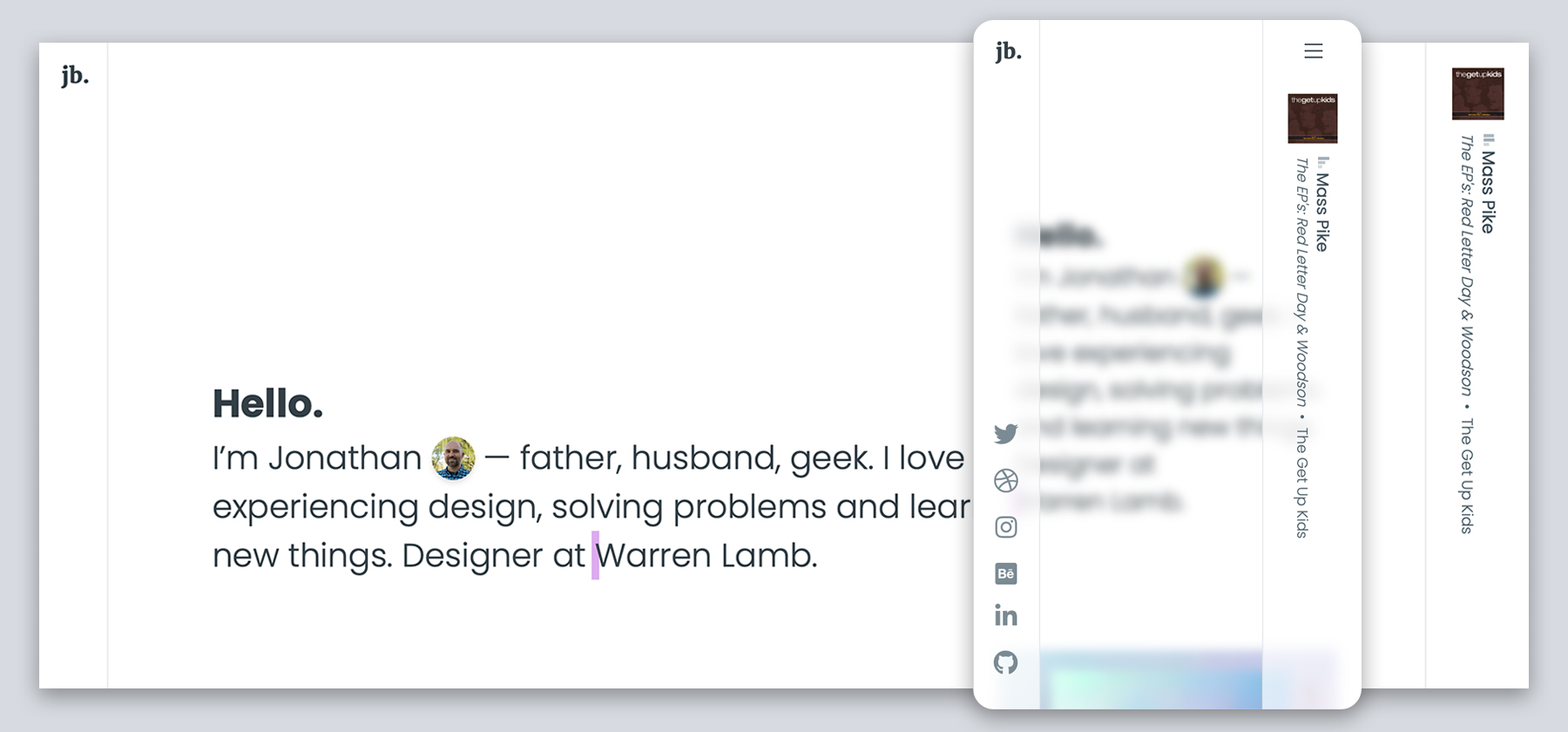
Recently someone on Twitter asked me how I had created the navigational layout for my site (ie: the right and left columns) and how the mobile interactivity worked. Here's a quick walkthrough with all the pieces. I cut out all my content to keep it bare-bones.
First, I should note that the site is built with Tailwind CSS. I include a CDN reference in the sample below, but would recommend using your own hosted copy.
Here's the basic HTML structure.
<!DOCTYPE html>
<html lang="en" class="center">
<head>
    <meta charset="utf-8">
    <meta name="viewport" content="width=device-width, initial-scale=1">

    <title>Title</title>

    <!-- Layout is primarily built with Tailwind -->
    <link href="https://unpkg.com/tailwindcss@^2/dist/tailwind.min.css" rel="stylesheet">

</head>
<body id="app" class="overflow-x-hidden">

<div class="relative">
    <!-- menu/frame container -->
    <div class="absolute w-screen h-screen overflow-hidden">

        <!-- overlay when mobile menu is open -->
        <div class="overlay"></div>

        <!-- mobile menu icon -->
        <div class="mobile-menu-container mobile-menu-reveal lg:hidden fixed top-0 right-0 text-xl w-16 text-center py-4 z-20 cursor-pointer lg:cursor-auto select-none" id="menu-toggle" onclick="openMainMenu(this)">

            <div class="pl-1">
                <div class="inline-block">
                    <span class="block mb-1 w-5 h-0.5 bg-black"></span>
                    <span class="block mb-1 w-5 h-0.5 bg-black"></span>
                    <span class="block w-5 h-0.5 bg-black"></span>
                </div>
            </div>
        </div>

        <!-- left side container -->
        <div class="fixed top-0 bottom-0 left-0 w-16 border-r border-gray-100 bg-transparent z-10 mobile-menu">
            <!-- left side container content -->
        </div> <!-- end left side container -->

        <!-- right side container -->
        <div class="right-column-container fixed top-0 bottom-0 right-0 w-24 border-l z-10 border-gray-100">
            <!-- right column content -->
        </div> <!-- end right side container -->
    </div> <!-- end menu/frame container -->

    <!-- main body container - goes close to left edge to right edge (to give appearance of center) -->
    <div>
        <!-- main content -->
    </div> <!-- end main body container -->
</div>

</body>
</html>
I couldn't do everything I wanted with Tailwind, so a little extra CSS had to be included. You'll see that some of it could have been done with Tailwind, but once I moved it out, I chose to do everything in the unique classes.
.overlay {
    display: none;
    opacity: 0;
    position: fixed;
    top: 0;
    bottom: 0;
    right: 0;
    left: 0;
    z-index: 1;
    transition: all .2s ease-in;
    -webkit-backdrop-filter: blur(5px);
    backdrop-filter: blur(5px);
}

.menu-open .overlay {
    display: block;
    opacity: 1;
}

@media (min-width: 1024px) {
    .overlay, .menu-open .overlay {
        display: none;
        opacity: 0;
    }
}

.mobile-menu {
    -ms-transform: translate(-100%, 0); /* IE 9 */
    transform: translate(-100%, 0); /* Standard syntax */
    transition: all .2s ease-in;
    -webkit-backdrop-filter: blur(5px);
    background-color: rgba(255, 255, 255, 0.7);
}

.mobile-menu-container {
    transition: all .2s ease-in;
}

.menu-open .mobile-menu-container {
    width: 96px;
}

.menu-open .mobile-menu {
    -ms-transform: translate(0, 0); /* IE 9 */
    transform: translate(0, 0); /* Standard syntax */
}

@media (min-width: 1024px) {
    .mobile-menu {
        -ms-transform: translate(0, 0); /* IE 9 */
        transform: translate(0, 0); /* Standard syntax */
    }
}

.right-column-container {
    -ms-transform: translate(100%, 0); /* IE 9 */
    transform: translate(100%, 0); /* Standard syntax */
    transition: all .2s ease-in;
    -webkit-backdrop-filter: blur(5px);
    background-color: rgba(255, 255, 255, 0.7);
}

.menu-open .right-column-container {
    -ms-transform: translate(0, 0); /* IE 9 */
    transform: translate(0, 0); /* Standard syntax */
}

@media (min-width: 1024px) {
    .right-column-container {
        -ms-transform: translate(0, 0); /* IE 9 */
        transform: translate(0, 0); /* Standard syntax */
    }
}
Lastly, we need the interactivity when the mobile menu button is clicked. This could be done lots of ways — but for simplicity I just used a little jquery.
<script src="https://code.jquery.com/jquery-3.5.1.min.js"
        integrity="sha256-9/aliU8dGd2tb6OSsuzixeV4y/faTqgFtohetphbbj0=" crossorigin="anonymous"></script>

<script>
    window.openMainMenu = function () {
        var element = document.getElementById("app");
        element.classList.toggle("menu-open");
    }
</script>
That's it! 🎉
If you use this, leave a comment or ping me on Twitter — I'd love to see what you come up with. 🙂